
How to Use Color to Brighten Your Home, Office with Lighting
Is it getting more spring-like in your neck of the woods? It certainly is here although some parts of the country are still seeing white stuff flying around. And that’s not pollen! Seriously, winter be gone already!
One thing I love about spring is the reemergence of color, especially outside my window. Bright yellow daffodils and lime green buds on the trees signal the start of something new. It’s a great time to reconsider the color inside your house as well. The experts all have an opinion on the hot new colors each year, so we’ve been poking around to see what trends are out there and how you can consider these when choosing your lighting.
Pantone, the color experts best known for their color matching system, regaled us in January with the news that Radiant Orchid was the Color of the Year. This brilliant fuchsia tone is fun and happy and appeals to many, but do you want to paint your entire living room this hue? If not, consider using a more neutral tone as your base then liven it up with colorful accessories such as throw pillows, curtains, and lighting.
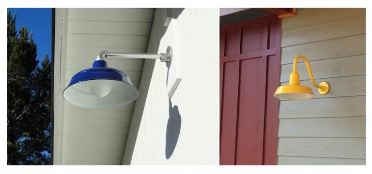
Our porcelain enamel color palette includes some striking shades that can add real focus and drama inside or out. Here a Cobalt Blue Bomber Gooseneck Light and a Buttery Yellow Original™ Gooseneck Light show how a bold shade can add a pop of color against a neutral siding.
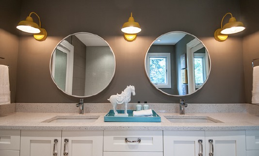
Combining soothing granite gray walls with a splash of yellow is another way to incorporate color into a space without going overboard. This delightful bathroom was created by our friend Alykhan Velji and is a great illustration on how a brilliant color like yellow can be paired with a more muted color like gray for a sophisticated yet relaxed look. You can read more about this bathroom space here.
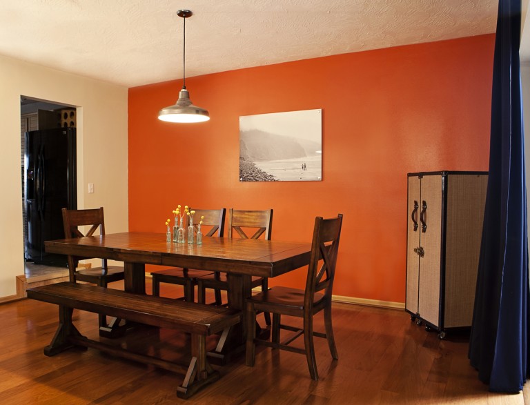
Feel daring enough for a bold wall color but not ready to dive in with an entire room? Choose an accent wall for your stroke of color then choose accessories such as this Union Pendant Light to complement the color rather than compete with it. This 16″ RLM-inspired warehouse shade is finished in Metallic Chrome for a sleek, modern look against the pumpkin wall.
While Radiant Orchid got a lot of publicity early on, pastel shades are also big this year. The blue and green colors of the seashore, for example, can give a sense of calmness and serenity to your home or office.
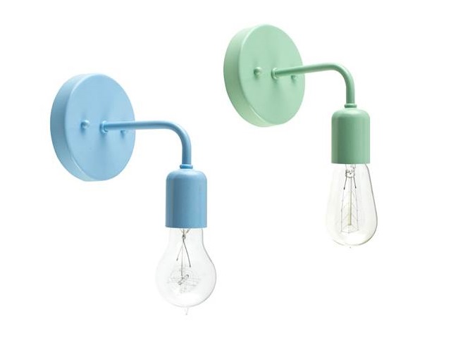
Our new Downtown Minimalist Sconce can add just the right touch of color with its clean and simple retro style. With our paint-to-match porcelain option, you can choose creamy Jadite or soft Delphite Blue to bring some soothing color to your space!
Bath photo courtesy Bookstrucker Photography, dining room photo courtesy Danielle Nichol Photography