

Guest Blogger | The New Pastels, From Sweet to Sensational in 3 Easy Steps
Decorating your home should be a fun form of creative, uninhibited self-expression. But if there’s one thing that can quickly kill those good vibes and strike fear in the hearts of even the most daring home decorators, it’s the mere mention of pastels.
What’s so intimidating about these springtime shades? It comes down to the thin line between sensational and saccharine and the dread of crossing it looms large over anyone who remembers the ‘90s.
But fear not! These sunny hues are popping up everywhere in the world of interiors and, with a few simple steps, can become a part of your world, too. Better get your sugar fix elsewhere because the new pastels are anything but sweet.
Step 1: Choose the right pastel
The new pastels refer to both the grown-up versions of these pigments as well as a different way of working with the classic Easter egg versions you know and (maybe) love. The first step? Selecting the pastel (or pastels) that’s right for you.
- If traditional pastels are your thing, baby blues, pale greens, and even buttery yellows are good baby steps for beginners. Because these colors can be found in nature, they feel subdued compared their pink and purple counterparts. They can even function as neutrals with the right palette and application.
- For a more mature, moodier pastel, opt for muddy, dusty, or chalky versions; their gray or brown undertones take the sweetness factor down several notches.
- Tread in calmer waters with ‘neutral’ pastels, which are essentially shades of gray with hints of color, like purple, blue, or sage green.
- Can’t pick just one? Go monochromatic with several hues of the same pastel, from light to bright and all the variants in between.
Step 2: Select a complementary color
So you’ve found The One. Like any lasting relationship, your pastel needs balance to keep it from veering on the syrupy side. From understated to provocative, shadowy to upbeat, classic to contemporary, it all comes down to the right counterpoint for your pastel paramour.
- To keep your space light and airy, pair your pastels with lots of white tones and light grays.
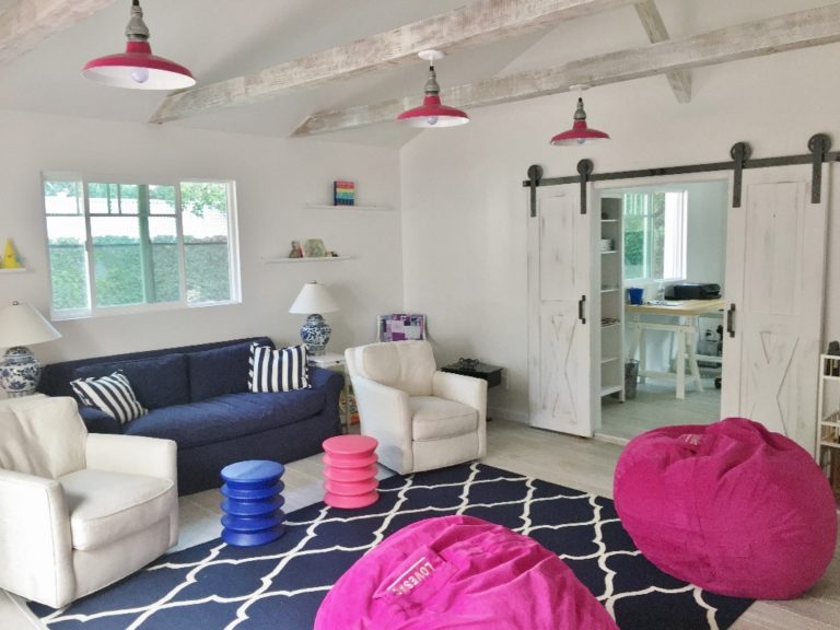
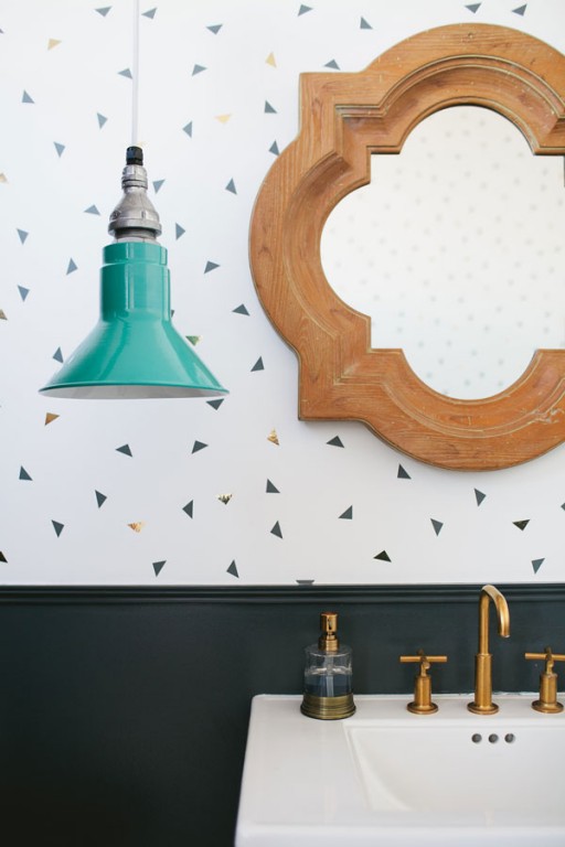
- Blacks, charcoal grays, and other deep, rich colors, on the other hand, keep pastels grounded, create high contrast, and offset sweetness.
- For a thoroughly modern look, match pastels with bright, saturated tones of the same or a contrasting color. For example, magenta makes both powdery pink and baby blue pop.
- Wood is the great equalizer. Lighter woods, like white oak, bamboo, and lighter maples, work with all pastels. Pinks and peachy pastels pair well with cherry wood, while mahogany and other dark woods complement yellows, blues, and greens.
Step 3: Tie it all together in a modern way
Now that you have your perfect pastel match and a few complementary hues in mind, it’s time to incorporate them into your home in a thoughtful, contemporary way.
- Start small with a few accessories or textiles, or create a singular moment like an accent wall in a pastel wash.
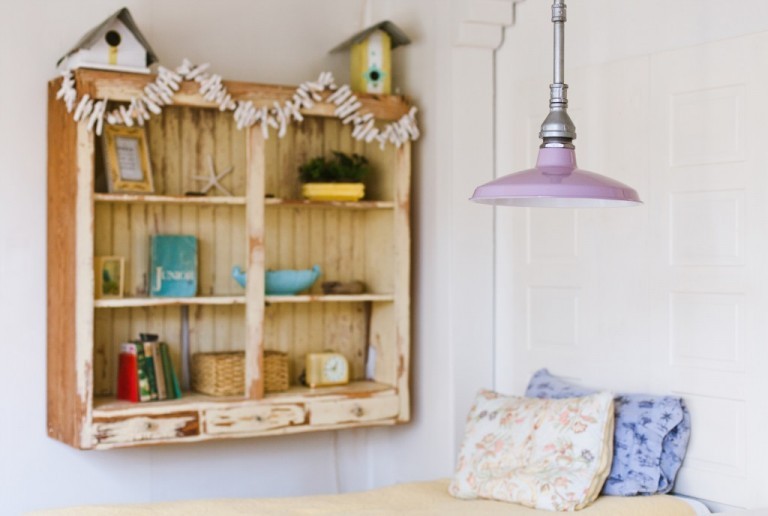
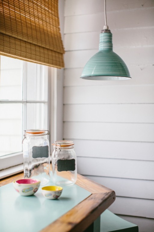
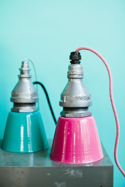
- Another way to dip your toes in the pastel pool is to look for pastel accents in familiar, classic styles, like vintage-inspired lighting and appliances.
- Pastels impart an air of relaxation, so use them in spaces where you want to imbue a sense of calm.
- Pastels also have inherent warmth. Add them to spaces that are all white, dominated by cool colors, or have a lot of cold, hard surfaces that might otherwise feel sterile.
- Opposites attract: rustic and industrial spaces and accessories strip away pastels’ candy coating. Think supple leathers, knotty woods, and edgy metals.
- Avoid going flat. Several complementary layers of texture, pattern, and color instantly take any design scheme from lackluster to magazine-worthy.
Remember: At the end of the day, successful design is what makes you happy, so don’t be afraid to break the ‘rules’ and just go with your gut. That’s what real style is all about.
Guest blogger Melissa Andersen is a writer, editor, blogger, and social media manager/consultant for clients
such as And North, Kaufmann Mercantile, and The Cousins from HGTV